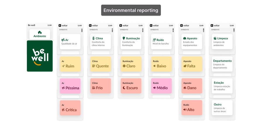
Be Well
Tetu
Volkswagem
Rummo
Be well - Health Check app
Well-being Application Project for Shop Floor Workers in Industry 4.0,carried out in partnership with Fraunhofer Portugal as part of the Specialization at Uporto.
My Contribution
Conducted comprehensive user research, including surveys for detailed data collection and analysis, extracted actionable insights, developed prototypes from low to high fidelity, and presented the proposed solutions.
Tools
Figma
Miro
Google Forms
Notion
07
2023
Team
Jeise Ramos
Irina Drofa
Supervisors
Ana Correia
Andreia S.
My process
Researching
▸ Interview stakeholders
▸ CSD matrix
▸ Research questions
▸ Define methods
Collecting data
▸ Benchmarking
▸ SotA research
▸ Questionnaire
▸ Fraunhofer reports
▸ Research field
Definition
▸ Proto-personas
▸ Affinity map
▸ Scenarios & requirements
▸ Criteria
Ideation & Dev
▸ Co-creation
▸ Flows
▸ Low-fi
▸ Mid-fi
▸ Prototype
Testing & Iterations
▸ Testing
▸ Iteration
▸ High-fi Prototypes
How might we
The project, developed with Fraunhofer Aicos, focused on creating a well-being tool to improve the physical and mental health of shop floor workers.
Exploration and Stakeholder Interviews
The study started with a literature review and benchmarking to explore best practices in well-being data visualization. Stakeholder interviews then defined the research scope, addressing topics like data relevance and display efficiency. This process also generated research questions and hypotheses about working conditions and key information visualization.
Puzzled
Charts are hard to interpret
Phonelink Lock
Mobile use is restricted on the shop floor
Project Management
There’s room for innovative ideas
Complaint
Direct worker interviews are challenging
Research Methodology
Our approach combined user interviews, open-ended surveys, and a literature review. Participants included factory workers from the furniture industry in Portugal and Brazil.
Desk Research and CSD Matrix
We initiated the research with the CSD Matrix (Certainties, Suppositions, Doubts) to define the challenge's scope. This tool organized our existing knowledge, assumptions, and unknowns, guiding us in prioritizing tasks and identifying key areas for further investigation.
Research questions:
1. What workplace well-being criteria are highlighted in current studies?

2. How can physical and mental well-being be measured?

3. How do factory workers perceive their well-being?

4. Which criteria are crucial for assessing well-being levels?

5. How can these criteria be visualized, considering different ages and limited digital literacy?
Research Scope
SoTA/Literature Review
We analyzed 22 sources, including articles and reports on workplace well-being.
The literature review aimed to:
▸ Establish the theoretical foundation of the research;
▸ Validate the relevance of our research questions;
▸ Clarify focus areas, challenges, and hypotheses;
▸ Justify the significance of the problem being addressed.
Body
Physical
▸ Health state
▸ Cardiovascular
▸ Musculoskeletal
▸ Shoulders
▸ Back
▸ Neck
▸ Upper limbs
▸ Lower limbs
Brain
Mental
▸ Autonomy
▸ Relationships
▸ Working speed
▸ Job satisfaction level
▸ Workload level
▸ Role clarity
▸ Poor communication
▸ Job insecurity
▸ Personality type
▸ Health satisfaction
▸ Income satisfaction
▸ Anger
▸ Worry
▸ Happiness
Sports Mode
Character of work
▸ Prolonged sitting or standing
▸ Repetitive or forceful movements
▸ Lifting or moving heavy loads
▸ Awkward and static postures
▸ Long or irregular working hours
▸ Shifts
▸ Breaks
▸ Speed of work
Building With Rooftop Terrace
Environment
▸ Lighting
▸ Temperature
▸ Cleanliness
▸ Chemical or biological substances
▸ Loud noise
▸ Social contact
▸ Culture
▸ Vibration
2. Data Collection
Focus Questions
How do these platforms clearly and effectively represent well-being data?
What well-being criteria do other platforms use, both physical and psychosocial?
We categorized well-being criteria into two main groups:
Physical and Biomechanical: Environmental factors, tasks, movements, and risks like heavy lifting, poor posture, and cold conditions.
Psychosocial:
High job demands, low autonomy, and challenges such as bullying and discrimination.
Key requirements for the well-being app included data privacy, access control, system compatibility, multi-device accessibility, and usability in noisy environments. The research highlighted the importance of addressing both physical and psychosocial factors with clear, customizable solutions.
Benchmark
We reviewed well-being apps, fitness tools, and wearables tracking metrics like sleep, diet, mood, and stress. This benchmark revealed key factors of well-being and various methods for visualizing physical and mental health data, including mood and energy levels.
Field Observation
From March to April 2023, we visited three furniture factories in the Porto area: an upholstered furniture factory, a wooden furniture factory, and a metal (brass) factory.
During the visits, we observed:
Factory Workforce: Worker numbers, age range, role distribution, mood, and communication dynamics.
Workplace and Job Nature: Worker positions, lifting activities, tool usage, and communication methods.
Environmental Characteristics: Lighting, temperature, noise, dust, odors, and overall comfort.
These observations helped validate criteria related to workplace quality and its impact on workers' well-being.
Management
Demographics of workers
▸ Small teams of 2-4 people
▸ Mostly male, between 30 and 60 y.o.
▸ Work with their hands constructing furniture pieces and machines working with wood
▸ Very good qualified masters, probably with a lot of working experience, but not well educated
▸ Look like working class people without college degree
▸ Don't speak English
Green Earth
Environment factors
▸ Vibration
▸ Lighting
▸ Temperature
▸ Cleanliness
▸ Chemical or biological substances
▸ Loud noise
▸ Social contact
▸ Culture
Survey
We conducted a survey to gather insights from employees, focusing on:
Identifying key well-being concerns and challenges.
Understanding how employees manage their physical and mental well-being.
Exploring perceptions of factors affecting comfort at work.
Identifying opportunities for additional support and resources.
We interviewed 15 furniture factory workers from Portugal and Brazil. Ten participants reported regular physical pain but did not prioritize mental health. Key well-being factors included relationships with colleagues, salary, work environment, equipment, cleanliness, temperature, workstation setup, and lighting. Comparing these findings with existing studies helped shape the well-being criteria that informed the app's development.
Tear-Off Calendar
Age
▸9 over than 35 years
▸4 between 35 and 44
▸4 between 25 a 34
▸2 between 18 and 24
▸2 users 55+
Shopping Bag
Position in the company
▸5 machine operators
▸3 production operator
▸ Technical Designer
▸ Team leader
▸ Quality controller
▸ Furniture Polishing
▸ Joiner/Carpenter
Open End Wrench
Activities in your role
▸ Physical effort
▸ Repetitive effort
▸ Contact with machines
▸ Standing time
▸ Contact with chemicals
Doctors Bag
Health care
▸10/15 Musculoskeletal pain
▸ 0/15 Mentioned mental care
▸ 8/15 Annual health monitoring
▸ 7/15 Some physical activity
▸ 4/7 Practice walking
Happy
They feel good at work
▸ Transparent information
▸ Ergonomic environment
▸ Productive environment
▸ Accomplishment
▸ Safe environment
▸ Organized routine
▸ No pressure
▸ Interpersonal relationship
▸ Organizational culture
Psychotherapy
Mental care
▸8/15 Suffer from stress
▸6/15 Have anxiety
▸ 7/15 Stressed very rarely
▸ 5/15 Never consulted and does not feel the need for mental care
Critical Thinking
Factors mental/emotional
▸ 12/15 Relationship with colleagues
▸ 9/15 Salary
▸9/15 Environment and equipment
▸ 6/15 Company culture
▸ 6/15 Relationship with management
▸ 1/15 Stress level
Natural User Interface 1
Factors physical
▸9/15 Cleaning of spaces
▸8/15 Temperature
▸ 8/15 Workstation
▸ 7/15 Brightness
▸ 6/15 Noise level
▸ 5/15 Clothing
▸ 5/15 Equipment
▸ 3/15 Air cleaning
Proto-Persona
Due to interview challenges, we created a proto-persona, João, a shop floor worker facing physical discomfort and issues with interpreting charts. The limited use of mobile phones in factories influenced the development of a practical, accessible solution tailored to our target group’s needs.
Worker
João Silva
40 years
Machine operator
Lives in Rio Tinto
Motivations
▸ Work with machinery
▸ Light physical activity in the week just for health
▸ Have at least one annual medical checkup
▸ I don't usually take measures to take care of mental health
and I'm not interested
▸ I don't suffer from stress often
Thumbs Up
Needs and expectations
▸ Having an organized routine at work
▸ Relate with teammates and have a good relationship with colleagues
▸ Rest in the intervals
▸ Have free break time to carry out the activity that you find most appropriate
▸ Feed and hydrate during the day
▸ Have a work environment without too many interferences
▸ Work in an environment with ideal lighting
▸ Keep your workstation clean and organized
▸ Always have clothing and equipment suitable for my role
▸ Work in a comfortable temperature environment
Thumbs Down
Pain points and frustrations
▸ I have muscle pain constantly
▸ The noise level is sometimes annoying
▸ I feel stressed at work, but only in emergency situations
▸ Sometimes the work environment is not 100% clean,
bright, and with the ideal temperature
▸ The environment is sometimes too bright or too dark
▸ I perform repetitive effort and/or manual effort
▸ I work a lot of time standing
Scenarios
The scenarios were developed using an affinity map, reflecting the needs and challenges identified for the proto-persona João. The following scenarios were established for him:
▸ Problem Reporting: João needs to report, edit, and delete workplace issues, with accessible options on wearable devices.
▸ Problem Visualization: He wants an overview of issues to assist management in improving working conditions, with a simple interface suitable for limited digital literacy.
▸ Problem Filtering: The ability to filter and view specific problems as needed.
▸ Resolution Tracking: João wants to track the status of reported issues and receive clear updates on corrective actions via notifications on his wearable device.
Improvement Recommendations: Practical suggestions to mitigate workplace issues, designed with the constraints of accessing solutions during work hours in mind.
▸ Alert Notifications: Discreet reminders to report issues without disrupting his workflow.
3. Opportunities
Requirement and Functionality Definition
Functional Requirements
Problem Display with a categorized list and intuitive charts, reducing the need for extensive reading.
Intuitive Filtering with easy-to-use filters for limited digital literacy.
Notifications and Updates with adjustable alerts that don't disrupt workflow.
Metric Comparison allowing simple comparisons across work areas.
Personalized Recommendations offering practical suggestions based on collected data.
Well-being Tracking displaying João’s history and progress in charts.
Customizable Alert Criteria enabling alerts to be personalized by frequency and type according to João’s needs.
Usability Requirements
▸User-Friendly Interface with simple, intuitive navigation for low digital literacy.
▸Consistent Experience with uniform visuals and features across smartwatch and smartphone, responsive to screen sizes.
▸Immediate Feedback providing clear responses to actions, adapted to the device.
▸Accessibility with an interface suitable for noisy environments and low visibility, using simplified language.
▸Personalization with customizable avatars for easy identification.
▸Responsive Design adaptable to different screen sizes, optimized for factory settings.
▸Help and Documentation with guides and tutorials to assist with functionality and metric interpretation.
Limitations of Use in Factory Environments
Insights from Fraunhofer indicate limited access to mobile devices during work hours, with most workers using them only during breaks or shift changes. Therefore, the wearable device should avoid disrupting workflow, with no audible alerts or vibrations. The design must also accommodate the noisy environment and low visibility typical during working hours.
Criteria
The identified evaluation criteria were organized as follows:
Environment
▸ Cleanliness Includes department, workstation, and surrounding areas.
▸ Lighting
▸ Temperature
▸ Air Quality
▸ Equipment Issues related to PPE and workspace/station setup
Body
▸ Body Part: Neck, back, upper and lower limbs.
▸ Movements: Handling, holding, lifting, carrying, moving, supporting, pushing/pulling, exertion, rotating, transporting, repetitive actions.
▸ Physical Effort: Intense, medium, light.
▸ Posture: Static, uncomfortable, tiring, awkward, painful, head tilt, above shoulder height, bent back, knee positions, squatting.
▸ Position: Standing, walking, sitting.
Ideation Process
Given the restrictions on cellphone use on certain factory floors, we faced the challenge of designing a practical solution that allows workers to log their physical conditions and work environment using smartwatches. In parallel, we made these features available on a mobile app, enabling report submissions during shifts and easy review afterward.
Smartwatch for Workers
We developed a smartwatch prototype that allows workers to submit reports directly from the device. The simplified screens are optimized for quick data input, accommodating the small screen size and limited interaction options. This ensures efficient and practical reporting of physical and environmental issues.
Mobile App for Workers
We created a complementary platform for workers to edit, complete, and view their reports, as well as access organized well-being statistics:
▸ Report Editing: The mobile app allows workers to review and add details to the information logged via the smartwatch.
▸ Statistics Visualization: Offers clear and organized data in daily, weekly, and monthly graphs, simplifying the monitoring of work conditions.
Mobile App for Managers
For managers, we developed an advanced prototype that includes:
▸ Detailed Statistics: Access to anonymous reports, with department-level comparisons.
▸ Environmental Monitoring: Analysis and comparison of environmental data across various periods and sectors.
4. Solution
Wireflows
During the ideation phase, we created low-fidelity prototypes focused on three essential user flows: issue reporting, data monitoring, and information display. Each flow underwent usability testing to ensure they addressed the specific needs of factory workers and managers effectively.
Smartwatch
We developed a streamlined series of screens for the smartwatch, enabling workers to quickly log their physical condition and environment with just a few taps. The design was optimized for a small-screen device, offering a straightforward, efficient logging experience. First screen flow for autonomous logging. (image)
Mobile App
Mobile app provides workers with organized access to data, displayed in daily, weekly, and monthly charts to facilitate monitoring of workplace conditions. Workers can easily view and edit their logs, ensuring a user-friendly experience. First flow for personal condition monitoring.
For Managers
We developed a dedicated flow for managers to view workers' reported physical and environmental conditions. This includes the ability to compare data against environmental sensor readings for deeper insights.
User Testing and Evaluation
Following initial tests, we implemented multiple refinements in both the smartwatch and mobile app prototypes. These updates aimed to enhance the user experience, simplify navigation, and ensure that functionalities met the needs of both factory workers and managers. Key improvements focused on visual alignment, flow simplification, and clarity of elements.
Smartwatch
Usability tests included:
▸ Monitored Testing: Conducted with 2 users to evaluate interface usability.
▸ Unmonitored Testing: Completed with 10 users via Maze, including participants with varying familiarity with smartwatches.
▸ SUS Questionnaire: Used to assess overall user experience and satisfaction.
Mobile App
To validate the information architecture and usability, we utilized:
▸ Design Validation: Performed with 3 designers to ensure content clarity, logical organization, and intuitiveness.
▸ Tree Testing and Think-Aloud Protocol: Analysis focused on information structure and ease of navigation.
Testing Results
Smartwatch
Feedback indicated areas for improvement to enhance navigation and adapt the interface to typical smartwatch use:
▸ Visual Alignment: Ensure consistency with the mobile app’s design language.
▸ Flow Simplification: Reduce steps and remove redundant screens.
▸ Component Adjustment: Increase button and icon sizes for easier interaction.
▸ Improved Text and Icon Clarity: Enhance comprehension and ease of use.
Mobile App
Feedback from designers highlighted further improvements in navigation and information clarity:
▸ Content Reorganization: Remove redundant information and restructure for direct viewing.
▸ Clarity in Body and Environment Criteria: Use distinct colors to differentiate reported from unreported parameters.
▸ Ease of Login and Start: Simplify the access flow.
▸ Centralized Reporting Screen: Create a unified screen for viewing Body and Environment reports, facilitating direct monitoring.
5. Project Delivery
High-Fidelity Prototypes
High-fidelity prototypes were developed based on low-fidelity models, ensuring consistency across devices and a uniform experience despite usability differences. Advanced testing and the development of the management app were postponed to a later phase.
Smartwatch Prototype
We streamlined the report flow by removing redundant screens and adjusting the interface to fit the smartwatch format. Link to access prototype of Smartwatch.
Mobile Device Prototype
The focus was on creating an informative and essential interface for viewing and reporting issues. This included onboarding as well as editing and deletion features, minimizing errors and ensuring clarity for users. Link to access prototype of Worker’s App.
ConclusIon
The project successfully mapped well-being criteria and defined key requirements for the development of an application focused on the well-being of factory workers, despite limited access to users. The data collected provides a solid foundation for creating a practical and effective tool, aligned with Industry 4.0 principles, aimed at improving the physical and mental health of workers. Critical well-being factors were identified, including physical health, working conditions, team dynamics, and even external influences such as sleep and nutrition. This topic still requires ongoing studies and collaboration among companies, workers, designers, researchers, and healthcare professionals to foster a healthier work environment. Contributing to this project was both challenging and inspiring, further emphasizing its potential impact for the future.
TETU - Architecture Website
We created a mobile-first website for TETU, a product and architectural design company, focusing on a unique experience that aligns with their brand identity.
My Contribution
As UX/UI Designer, I led research, crafted wireframes, designed interfaces aligned with TETU's values, and collaborated with stakeholders to refine the design. I've worked with Rafael to perfect animations and the prototype.
Tools
Adobe
XDMiro
02
2020
Team
Jeise Ramos
Ricardo
Victor V.
Rafael B.
My Process
Exploration
▸ Stakeholder interviews
▸ Collaborative sessions with the branding team
▸ Competitive benchmarking
Construction
▸ Sitemap creation
▸ Low-fidelity wireframes
Refinement
▸ Stakeholder feedback loops
▸ High-fidelity prototypes with interactions
Delivery
▸ Final files and interactive prototypes handed off to external developers
Creative Process
Designing TETU’s website was a challenge that merged design and strategy to convey the concept of "affectionate design" into a sophisticated, intuitive digital experience. The goal was to reflect the brand’s core values — craftsmanship, legacy, and unique visual identity — through a site that balanced elegance, lightness, and simplicity, with a mobile-first navigation approach.
Exploration and Stakeholder Interviews
To align the project with the brand’s identity, we conducted an immersive collaboration with Studio Jasmin Manga, the team behind TETU’s branding. Together, we defined three visual pillars:
Lightness
to create a welcoming experience.
Sophistication
to communicate authenticity.
Sobriety
to present content in a clean, focused manner.
We performed detailed benchmarking, analyzing typography, color palette, and visual structure. These elements reinforced the concept of “affectionate design” across every site interaction.
From Ideation to Delivery
We started with a sitemap to structure navigation and ensure seamless transitions between sections. Adopting a mobile-first approach, we designed for an initial resolution of 360x640px, exploring various layouts and interactions to combine functionality with inspiration.
Key Steps:
1. Low-Fidelity Wireframes
Validated information architecture with stakeholders.
2. Interactive Prototypes
Presented for client feedback and iteration.
Style Guide Development
Expanded to ensure consistency in:
Typography: Bodoni for headings, Gill Sans for support, and Open Sans for digital content, balancing refinement and readability.
Color Palette: Primary colors aligned with institutional identity, complemented by secondary tones for contrast and visual harmony.Following design approval, we organized and handed off assets to external developers, overseeing implementation to ensure fidelity to the original concept.
Final Outcome
The TETU website encapsulates the brand’s essence, offering a visually clean yet emotionally engaging experience tailored to its audience. Responsive design and seamless navigation highlight the company’s portfolio, reinforcing its position as a leader in product and architectural design.
Volkswagem
Heuristic and acessibility avaliation from Volkswagen Portugal website’s As part of Postgraduate Program in Web Design and Usability at ESEC (2023/24).
My Contribution
I made all parts of the project, analyzed the usability and accessibility of the website, focusing on the car configuration flow. Following user testing, metrics and mid-fidelity prototypes were developed.
Tools
Figma
Figjam
Google workspace
Old and gold friend, paper
07
2023
Team
Jeise Ramos
Supervisors
Vitor Carvalhinho
My process
Analyze
Heuristic Evaluation
▸Simulate User Experience
▸Identify Issues
▸Consolidate Results
Test Passed
Usability Testing
▸Test Planning and execution
▸Issues Identified
▸Results Analysis
Line Chart
Usability Metrics
▸Metrics Plan and execution
▸Results Analysis
Web Accessibility
Accessibility Assessment
▸Acess monitor
▸Screenreader
▸Results Analysis
▸Definition of mos valuable problems
Design
Prototyping and Redesign
▸User Scenario and persona
▸Flux 37 signals
▸Paper prototype
▸Digital prototype
▸Tests
Project Overview
This project focused on analyzing the usability and accessibility of the Volkswagen Portugal website. After a heuristic evaluation and user testing, we identified pain points and created a usability metrics plan and accessibility assessment. The project ended with mid-fidelity prototypes to improve navigation and inclusivity for a better user experience.
1. Research and Problem Analysis
Analysis Process
Conduct a usability and accessibility study of a selected system, identifying pain points and proposing actionable solutions. The focus was on the car configuration flow on Volkswagen's platform, chosen for its potential to improve navigation and the clarity of information presented to users.
Heuristic Evaluation
A structured analysis approach was implemented:
Defining the scope, focusing on evaluating the car configuration process for users with different profiles like families and frequent travelers.
Simulating user experience by performing tasks that addressed diverse needs and contexts.
Identifying and documenting issues by collecting evidence through screenshots and videos, highlighting both positive and negative aspects.
Consolidating results by prioritizing 15 key issues and 5 positive aspects, mapping them to usability heuristics, and proposing improvements.
Evaluation Outcomes
Page
Positive Aspects
Negative Aspects
Home Page
Efficiency and Flexibility: Shortcuts improve navigation for experienced users.
Aesthetic and Minimalist Design: A clean, organized interface enhances clarity.
Low Visibility Buttons: Challenges navigation, particularly for novice users.  
Desktop Hamburger Menu: Adds unnecessary steps, compromising visibility.
Model Selection Page
System Status Visibility: Breadcrumb navigation clearly indicates user progress.
Error Prevention: Invalid filter options are automatically hidden.
Real-World Alignment: Realistic car images create an intuitive experience.
Technical Terminology: Confusing terms hinder understanding of packages and features.
Inconsistent Buttons: Some actions disrupt the flow without an easy return path.
Model Configuration 
▸ Error Prevention: Clear options, such as with or without VAT, reduce ambiguity.    
▸ Immediate Feedback: User changes are instantly reflected.
▸ Recognition Over Recall: Visual changes simplify understanding.
▸ Unclear Options: Vague package descriptions leave users uncertain.    
▸ Visual Inconsistencies: Secondary buttons confuse their intended purpose.  
▸ Inadequate Representation of Choices: Some configurations lack proper visual depictions.  
▸ Unnecessary Steps: Additional modals lengthen and complicate the process.
Improvement Recommendations
Text
Simplify Terminology
Use more accessible terms to ensure clarity for all users.
Single Choice
Standardize Visual Elements
Clearly represent all choices in the configuration flow.
Contrast
Enhance Button Visibility
Redesign navigation to highlight key actions.
Fast Forward
Streamline Steps
Eliminate unnecessary modals for a faster process.
U Turn to Left
Add CTAs to the Showroom
Ensure users can easily return to the configurator.
Expected Results
These improvements aim to make the car configuration process more intuitive and efficient, enhancing clarity and reducing user frustration. In addition to increasing satisfaction, they are expected to boost conversions by turning more visitors into customers.
2. Usability Testing
Objective
This phase focused on studying usability and accessibility through tests with real users, aiming to identify friction points and areas for improvement in the vehicle configuration flow.
Test Summary
Usability tests were conducted with three participants, both in-person and remotely, using the "thinking aloud" technique to observe real-time reactions while navigating the car configuration flow. The goal was to assess user experience, identify barriers, and suggest improvements.Participants were experienced drivers aged 25 to 60 with basic to intermediate digital literacy, recruited through direct invitation.
Tested Tasks
1. Browse and Select a Model: Locate and choose a car model of interest.
2. Configure Vehicle Engineering: Customize engine, transmission, and other technical aspects.
3. Adjust Exterior and Interior: Select colors, finishes, and interior features.
4. Add Accessories: Choose additional equipment for the car.
5. View Summary and Final Price: Review selections and check the total cost.
Results and Insights
Positive Findings
Real-Time Image Updates: Users appreciated immediate visual changes reflecting their selections.
Intuitive Summary Section: The summary and pricing section was clear and well-received.
Wide Range of Options: The extensive customization options were perceived as a strong positive.
Key Issues Identified
Task
Identified Problem
Severity
Proposed Solution
Task 1: Browse
Clicking images redirected to the showroom, disrupting the flow.
Critical
Integrate showroom and configurator; add a fixed navigation menu for continuous flow.
Task 2: Engineering
Technical options lacked clear descriptions.
Moderate
Provide explanatory text and visual examples for each option.
Task 3: Exterior
Overload of information made navigation confusing.
Critical
Reduce initial options and prioritize the most relevant ones.
Task 4: Accessories
Additional equipment lacked images or descriptions.
Moderate
Include images and short texts to visually explain the options.
Task 5: Summary
Users couldn’t view a finalized 3D model.
Cosmetic
Add a 3D preview showcasing the configured car.
Participant Feedback
Participant 1
Faced challenges navigating to the configuration due to redirectaion to the showroom. Found the flow confusing but praised the clarity of the summary section.
Participant 2
Highlighted the absence of descriptive visuals for accessories. Enjoyed the personalization process but suggested simplifying the initial steps.-
Participant 3
Felt overwhelmed by technical options and experienced difficulties transitioning between the showroom and configurator. Emphasized the need for improved navigation.
Recommendations for Improvement
Integrate Showroom and Configurator: Create a seamless transition or merge both into a unified flow.    
Enhance Visual and Textual Support: Offer detailed descriptions and supportive images to guide users during configuration.    
Simplify Initial Options: Reduce information overload at the start by prioritizing key choices.    
Fixed Navigation Menu: Implement a fixed menu for easier navigation, enabling users to revisit earlier steps without losing progress.    
3D Final Preview: Introduce a 3D view of the completed car, displaying all chosen configurations.
Expected Impact
▸Streamline the configuration process, reducing user frustration.
▸Enhance understanding of technical and aesthetic options, increasing user confidence in their choices.
▸Boost conversion rates, turning more visitors into customers by aligning the digital experience with consumer expectations.

Based on these findings, prioritizing these improvements will significantly optimize usability and accessibility while meeting business goals.
3. Metrics Study
Overview
The metrics plan for the Volkswagen website focused on two essential pillars to analyze the user experience:
Task Success Rate: Detailed performance evaluation of users in critical steps, based on usability tests.
Keystroke Level Model (KLM): Estimation of time and interactions required to complete specific actions on the website.
Metrics Plan
Task Success Rate
Performance was assessed across five main tasks during usability tests, identifying completion rates and difficulties:

Task 1: Finding and selecting a model.
Challenge: Most difficult task due to navigation complexity.

Task 5: Reviewing summary and price.    
Highlight:Successfully completed by all users without issues.
Task
Users Who Completed
Difficulty Level
Errors Found
Find and choose the model
2/3
High
Yes
Configure model engineering
3/3
High
Yes
Configure exterior and interior
3/3
Medium
No
Add equipment options
3/3
Low
No
View summary and price
3/3
None
No
Keystroke Level Model (KLM)
The KLM was applied to calculate the time required to access the T-Cross model configuration page, comparing two journeys: from the homepage and using a shortcut button.

Results:
▸ Via homepage: Estimated time: 4.00 seconds
▸ Via shortcut: Actual time: 4.52 seconds

Detailed timing for homepage navigation:
Action
Time (s)
Observations
Search menu (M)
0.20
Initial exploration in the menu.
Scroll page (H)
0.40
Locating the T-Cross model.
Position mouse (P)
1.50
Cursor adjustment to the button.
Click button (K)
0.70
Selecting the configuration option.
System response (R)
1.20
Page load time.
Total
4.00
Insights and Recommendations
1. Optimize Task Flows: Simplify the process of finding and selecting models to reduce user dropouts.
2. Error Reduction: Address usability issues in complex configuration tasks, especially in model engineering.
3. Improve System Responsiveness: Reduce load times during transitions to enhance user satisfaction.
4. Refine Analytics Tracking: Use data to continuously monitor and address high-abandonment funnel steps.
5. Enhance Accessibility: Align with recommendations from the accessibility study to improve overall navigation and task success.
4. Accessibility Study
Overview
An accessibility analysis of the Volkswagen website highlighted strengths but also revealed critical issues that affect the experience of users relying on assistive technologies. With an overall score of 8.1 on the Access Monitor, the site implements some best practices but requires improvements to achieve a more inclusive and accessible standard.
Screen reader
Positive Aspects
Button Naming: Buttons like “next” and “back” are correctly named, although carousel images are inaccessible due to missing descriptions.
Mapped Text: Some sections were correctly recognized by the screen reader.
Properly Named Links: Links such as “Modelos link header 3” demonstrated good semantic structure.
Well-Structured Informative Content: Headings were read appropriately, despite the lack of explicit references to hierarchy (e.g., "H").
Functional List Structure: Lists were well-constructed, facilitating navigation.
Problems and Recommendations
▸ Images with confusing descriptions include lengthy, irrelevant codes. Use alt="" for decorative images.
▸ Most buttons are implemented as links. Replace with proper buttons to enhance semantics and usability.
▸ Parallax navigation error causes keyboard navigation to freeze when exiting the fold, trapping users in empty states. Fix navigation flow to prevent this.
▸ Generic link descriptions, such as “Showroom link 6 20 group,” lack clear purposes. Provide unique, meaningful descriptions.
▸ Carousel navigation issues lead to users getting stuck on the "next/back" buttons. Improve carousel navigation logic.
▸ Inaccessible content blocks have generic descriptions and are not keyboard-accessible. Make all blocks interactive.
▸ Limited navigation restricts keyboard access to headings ("H"), focusing only on links. Allow full access to all elements.
▸ Interruptions from chat and questionnaire disrupt the user experience.
Ensure they are optional and easy to dismiss.
Automatic Validationwith Access Monitor
Key Issues Identified
Images Missing Alternative Text: Five images lack alt attributes, violating Success Criterion 1.1.1.
Inappropriate Empty alt: A decorative image should be styled via CSS, avoiding alt="".
Unnecessary Title Repetition: The title attribute repeats link text in 13 instances.
Links with Repeated Text and Different Destinations: Found in three groups, causing inconsistencies.
Incorrect Heading Hierarchy: Six violations in the sequence of 36 headings.
Low Color Contrast: Thirteen insufficient combinations, reducing readability.
HTML Errors: Seven structural issues affect cross-browser consistency.
Correctly Marked Language: Primary language is set to "pt-PT," following best practices.
Headings Without Accessible Names: Three headings are not properly interpreted.
ARIA Attribute Issues: Six elements have improper ARIA implementation.
Duplicate IDs: One case identified, potentially causing conflicts.
Links Without Accessible Names: Nine links lack proper descriptions.
General Recommendations
▸ Resolve keyboard and screen reader navigation issues, particularly in parallax and carousel components.
▸ Provide clear, accessible descriptions for links and images.
▸ Adjust color contrasts to meet readability standards.
▸ Fix HTML and ARIA implementation errors.
▸ Ensure all components and content blocks are keyboard-accessible.
▸ Make automatic features, like chat and questionnaires, optional and easy to disable.
Conclusion
Implementing the proposed improvements will significantly enhance the experience for users with special needs, promoting accessibility and usability. Beyond aligning with accessibility guidelines (WCAG), these changes will elevate the site's overall quality, improving the perception and satisfaction of all visitors.
5. Solution
The goal was to improve the flow between the showroom and configurator, simplify menu access, and clarify call-to-actions. By redesigning the site’s structure and testing with users, the updated experience offered a more intuitive journey, resulting in more efficiency and reduced friction.
User Scenario
Identified Persona:
Profile: A couple in their 30s living in a city with efficient public transport but seeking a car for occasional weekend trips.-
Motivation: To find a comfortable, affordable, and practical vehicle for long drives and leisure activities.
Context: Initial research on Volkswagen’s website to explore models and configure an ideal car within their budget.
Problems and Recommendations
Showroom Page
▸ Lack of configurator integration, where the showroom does not provide a direct pathway to start configuration.
▸ Flow interruptions, as users must manually navigate back to the homepage after exploring the showroom.
▸ Misaligned expectations, with elements on the showroom page creating confusion regarding the configurator's functionality.
Navigation Menu
▸ Parallel and unclear paths create uncertainty for users by offering multiple routes to the same goal.
▸ The hamburger menu on desktop is difficult to locate and interact with because it overlaps with imagery.
Solution Proposal
Adopted Strategies:
▸ The showroom was redesigned as an initial step within the configurator flow, offering continuity and context.
Visible and accessible menu: A fixed top menu replaces the hamburger menu on desktop, ensuring visibility and ease of use.    
▸ Optimized call-to-actions (CTAs): Button and link texts were rewritten to provide clarity, aligning user expectations with available actions.
Proposed Flow:
1. Homepage highlights the most popular models with a clear "View Models" button.
2. Models Page displays a list of vehicles with images, brief descriptions, and a "Configure" option.
3. Integrated Showroom Page features a 360° view of the chosen model and clear buttons for customization.
4. Configurator offers a guided menu that allows users to progressively choose colors, accessories, and packages.
5. Summary and Finalization presents the configured model with options to save, share, or schedule a test drive.
Prototypes
Paper Prototype:
Feedback Positive: Clear hierarchy supported quick navigation between steps.    
Feedback Negative: "Continue" button caused confusion about the next step.

Adjustments Made   
▸ Changed "Continue" to "Configure This Model" for clarity.    
▸ Prioritized detailed information on model pages.
Digital Prototype in Figma:
Insights from Testing
▸ Well-highlighted buttons and clickable areas reduced navigation errors.    
▸ Fixed top menu provided immediate access to key sections.    
▸ Transition between showroom and configurator still exhibited minor friction.

Adjustments Made
▸ Streamlined integration between showroom and configurator to remove unnecessary loading screens.
▸ Reduced the number of screens to optimize user time.
Final Results
Impact of Implemented Improvements:
The improved flow efficiency resulted in fewer clicks needed to configure a complete model, making the process more intuitive and less prone to errors. User satisfaction also increased, with testing showing positive feedback, particularly regarding the clear steps and the greater control users had over the configuration process.
Conclusion
The redesigned flow seamlessly combines efficiency, clarity, and accessibility, catering to user needs while strengthening Volkswagen’s digital experience.These improvements not only simplified navigation but also reinforced the brand’s commitment to customer-centric design, resulting in increased engagement, higher conversion rates, and a more positive perception among users.
Rummo
As part of a recruitment process, Procimo needed a challegng to create solutions to mission management, provide clear notifications, and ensure seamless workflows for drivers and internal teams.
My Contribution
I analyzed workflows, created user flows and developed components and high-fidelity prototypes. Designed features like automated notifications, real-time tracking, and mission history segmentation.
Tools
Figma
Figjam
07
2024
My process
Search More
Exploration and Understanding
Understanding the Problem
Defining scope
Benchmarking
Select Cell
Definition and Ideation
User Needs and Requirements
User Flow Mapping
Innovation
Ideation and Development
Creation of Components
Designing Prototypes
1.Challenge
Problem and mission
Problem
Renting a car typically takes over 75 minutes. Rummo simplifies this process by delivering cars to clients and picking them up post-rental. The operational efficiency relies on drivers managing their missions (drop-offs and pick-ups) seamlessly.

Objective: Create a user-friendly mobile solution for Rummo drivers to:
▸View, accept, or deny new missions.
▸Manage their mission schedules (past, ongoing, and upcoming).
Driver Missions Overview
Drop-Off: Pick up a car from a parking lot and deliver it to a client’s specified address. Includes starting and delivery times based on average travel durations.
Pick-Up: Retrieve the car from a client’s location and return it to the designated parking lot.
Key Features
▸Notifications for mission reminders and new assignments.
▸Display mission details: car model, license plate, locations, client name, contact, and booking ID/QR code.
▸A schedule list to track accepted, pending, and completed missions.
Deliverables
User Flows: For viewing, accepting/denying, and managing missions.
Designs: Wireframes and mobile mockups in Figma, aligning with Rummo's brand guidelines (colors, typography, logos). Include structural explanations for the proposed solution.
2. Process
Exploration and Understanding
Defining the Ideal Process
I mapped the existing interface, reviewed operational workflows, and raised technical questions with the development and product management teams.
I explored timelines, core features, and system-specific dynamics, such as criteria for mission notifications and the impact of simultaneous driver confirmations.
Approach Taken
Analyzed the current interface and reviewed operational workflows to identify pain points and opportunities.
Research and Benchmarking
Studied similar service platforms (e.g., car rental apps and transportation apps) and aligned the solution with Rummo's design style guide.

Central question
How can we create a user-friendly experience that simplifies mission management and tracking for drivers?
3. Definition and Creation
Defining Requirements and Workflows
Detailed the steps for key driver tasks:
Drop-off:
Picking up and delivering the vehicle to the customer’s location.
Pick-up: Collecting the vehicle from the customer and returning it to the parking area.

Structured clear notifications with essential details, including times, locations, vehicle, and customer information.
Creation
Mapped out the complete User Flow, addressing various scenarios such as time-specific notifications and mission history management (past and upcoming).
Interface Design
▸Designed some components, used library disponible, and designed high-fidelity wireframes aligned with Rummo's visual identity.
▸Focused on intuitive screens that facilitated quick decision-making and urgency, incorporating features like real-time maps and automated notifications.
Developed Solutions
Mission Notification Screen: Comprehensive details on routes, schedules, and critical data (e.g., vehicle, customer, QR code).
Confirmation and Status System: Enabled drivers to confirm mission steps (pickup and delivery) and report delays.
Mission History Tracking: Clear segmentation of past and upcoming missions, with structured data for monitoring.
Automation and Real-Time Tracking: GPS integration for live updates and automated notifications with timers.
4. Results
Deliverables
Efficient Management: Drivers can now view, accept, or decline missions effortlessly, with access to well-organized mission histories.
Smart Solutions: Automated notifications and GPS integration created a smoother, trackable journey for drivers.
User Engagement: The streamlined flow and functional design enhanced the user experience for all stakeholders.
ConclusIon
Although this project was designed as a test case, it provided a valuable opportunity to transform complex processes into simple, effective solutions within a limited timeframe. By combining user-centered design with agile execution, the final solution successfully balanced technical requirements with an exceptional user experience.